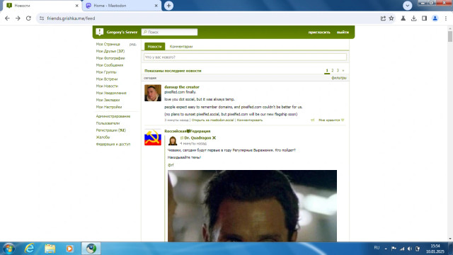
What exactly is gained here by writing "last week" instead of the precise timestamp? It's not like there's a lack of space there either.
I see this UX mistake very often. It's maddening. GitHub is one of the worst offenders. Instagram is also guilty of this with its "3214 weeks ago".












Hi @grishka,
personally I like 'human readable', coarse times consisting of only 2 parts and a single granularity: a few digits (max 1 decimal) + unit. But I consider the full fine data down to the second as e.g. tooltip (html title attribute) mandatory.
It's a matter of taste. To decide, (I) always do (say: try) a #UX #test with a number of real people.
@grishka I do like it though. For me getting sense of time with absolute dates can be a little tricky, and here it just says the thing happened past week, and provides ability to view the full date if necessary. I think it's actually great. Instagram example is not great, on the other hand. I think after a week it doesn't make much sense to have relative date, but where date is not important and UI is constrained, providing relative time is fine, but only AS LONG as there option to view date
@grishka I remember https://www.slashdot.org having a setting for this many years ago. 😋